
19
theSun ON FRIDAY
|
NOVEMBER 4, 2016
>Common interior designmistakes
Big
bad blunders
A
CCORDING
to experts,
making decorating boo-
boos is more common than
one would think, despite
themany articles, books, guides and
interviews with interior designers
out there. Say some industry
professionals, somemistakes are so
easily committed that even
designers long in the business
themselves make them.
In this article, interior designers
weigh in themost common interior
designmistakes that almost
everyone will, if not would have
already committed, in their homes.
ZERO-PLANNING
Too often, excited homeowners
have an idea of what theywant their
home to look like without taking
into consideration the cost and
space needed to recreate that said
look.
It is good to knowwhat youwant
a particular room to look like, but
establish a budget andmeasure the
dimensions of the room first. With
the necessary information at hand,
it will be easier to take your dream
design and rework it into the
“template” that you have.
Look for online room
arrangement tools to helpwith
visualising your dreamdesign and
plan the room layout before starting
work on it. It takes a lot of planning
to get that dreamhome you sawon
Pinterest. Moreover, every item
that goes into the room should
complement each other. It is
common to forget that principle,
which has seenmany homeowners
purchasing items in isolation and
do not think how it could or can’t
workwith the other pieces.
ONE SIZE FOR ALL
Having a good layout will also help
you avoid unnecessary spending on
furniture that ends up cluttering a
space.
Homepolish interior designer
AshlieMastony remarked that it is
more financially savvy to invest in
one slightly expensive statement
piece than buying lots of
inexpensive small
accessories to function
as accents.
“Themost common
interior designmistake
I see iswhen people
buy lots of small
furniture pieces, or
piles of accessories, to
avoid investing in a big
high-impact item like a
great sofa, an awesome
headboard, or an
amazing piece of art. In
the end, the little things
cost just asmuch and
space feels cluttered
rather than cohesive,”
Mastony said.
Hutsly founder
AnthonyGrosbois
chimes in saying, “A
small sofa plus a small
table and a small lamp
equates to a small idea.
Consistency is not
always a good thing!
Playing on the scale of
your furnishing is a
great way to add some
interest to your room.”
London-based
interior designer
Abigail Ahearn agrees
too, adding that one
simple stylingmistake
could prevent a room
fromreaching its full
potential. “If everything
is the same size or if everything is
either too big or too small, your
roomwill read like a hot mess,”
Ahearn explained. “The easiest trick
is to think of your space as a city and
fill it with a combination of heights
and proportions. Look at any
cityscape and you’ll find this
intriguingmix of scale and a unique
blend of fascinating shapes ... that’s
what youwant to nail!”
RAYOF LIGHT
Just one ray of light, that is. Most
Malaysian homes have the typical
fluorescent tube lamps in their
home.What’s important is having
layered lighting options and
dimmers in the home.
“Lighting is incredibly important
in any space.When lighting is
washed over you fromabove, it
can be unflattering and harsh,” said
EyeSwoon founder
Athena Calderone.
Calderone notes that overhead
lighting often seems like themost
obvious choice, but various light
sources are needed to create an
ambience, especially a cosy and
captivating one. “Always choose soft
white bulbs. Harsh fluorescent or
white lights canmake a space feel
stark and uninviting,” she added.
Interior designerMaryCook
shared her tips on choosing the right
lighting. “You have to think about
the colour of light, the quantity of
light andwhere to place it. You have
to think about light at various times
of the day and various times of the
year,” Cook said.
“The best way to design your
lighting for success is in layerswith
asmany of those layers as possible to
be switched separately and on
dimmers. So nowyou can adjust
your lighting for whatever kind of
mood youwant,” Cook added.
Citing a recent project with her
partner, Michael Smith, the duo shed
some light onways to layer lighting
in a home. “In two-storey foyers or
staircases, wewill often use clusters
or groupings of fixtures together to
add impact at the right scale. In the
dining room, we integrate
chandeliers or pairs of chandeliers
to light the space and add
decorative interest. Table lamps
are next to the living room sofa or
on a nightstand in the bedrooms.”
COLD FEET
Rugs are largely under appreciated
accessories. In the day of open
concept homes, rugs serve to define
spaces and draw boundaries
between the varied functions of a
home.
The living room is a prime
example of when a rug comes in
handy. Sadly, not only is there a
strong dislike for rugs in
Malaysian homes – primarily due
to “high maintenance”; the wrong
size is usually picked out for its
intended function.
“Living room rugs should be big
enough for at least two legs of each
furniture piece to be on it, if not all
four,” said home style expert Emily
Henderson, who lists small rugs as
one of her design pet peeves. “A
living room rug should really
ground the whole seating around it.
It tells everyone that this is where
the conversation is. A small rug
makes it feel disjointed and really
cheapens everything.”
Henderson insists that living
room rugs should be at least 8ft x
10ft. “Considering a 4ft x 6ft? Don’t.
That’s fine next to a bed, in a
kitchen, or in an entrance way, but
a 4ft x 6ft rug will assuredly not
work in your living room.”
LACKING PERSONALITY
Lastly, never give in to the
pressures of having the latest home
design trends. Even leading interior
designer and TV personality
Nate Berkus believes the same.
“The mistake people make is that
they’re often insecure. They look
over their shoulder and listen to
what everyone else is talking about
instead of sitting down and asking,
‘What do I really love?’”
So, take time to sit and jot down
what you like within your home.
Do research and skim through the
common blunders mentioned
above to ensure you haven’t made
the same mistake. Then slowly
but surely decorate interiors in the
way you would feel most
comfortable living in.
Trends merely serve as
inspiration for future re-
decorations and as a point of
discovery of one’s preferred home
design. The rule of thumb – create
a home that you would love to live
in rather than one that is just nice
to look at.
Email your feedback and
queries to: propertyqs@
thesundaily.comX
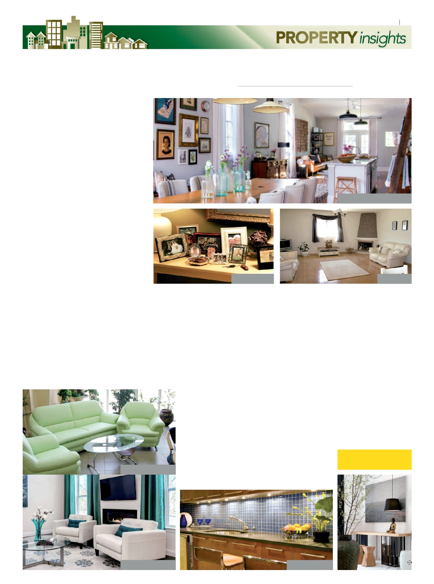
Floating rugs.
Decor or clutter?
Too large and bulky.
Balanced furniture.
Functional lighting.
PHOTO: WWW.POPSUGAR.COM
PHOTO: WWW.HGTVCOM
PHOTO: WWW.HGTVCOM
PHOTO: WWW.HGTVCOM
PHOTO: WWW.HGTVCOM
PHOTO: TEMPODADELICADEZA.COM.BR
Depicting a home that is ‘lived-in’.


