
ON FRIDAY
DECEMBER 4, 2015
Email your feedback and
queries to: propertyqs@
thesundaily.comX
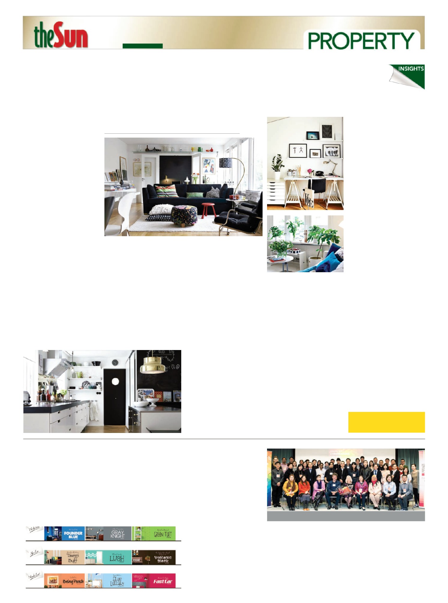
> Scandinavian design exudes simplicity,
aesthetic design and functionality
Modern
meets
simple sophistication
S
CANDINAVIAN
design
embodies modern-
contemporary black and
white furniture, similarly
colouredwalls and flooring, with an
added pop of colour from
decorative items. Characterised by
its minimalismand function, it is the
go-to design for those who love
calm, open spaces.
HISTORY
The term “Scandinavian design”
emerged in the 1950s. It described
aminimalistic design style that
originated from in the Nordic
countries like Denmark, Norway
and Sweden.
The year was 1947, and the “La
Triennale di Milano” exhibition
was going on inMilan, Italy. On
displaywere furniture, glassware
and home accessories fromNordic
countries. These were the highlight
of the show.
Fromhere, the fad grew, creating
a hype that led to the “Design in
Scandinavia” show going on tour
around the United States and
Canada from 1954 until 1957. In the
era where the current trend for
home decoration revolved around
luxurious and ornate designs, which
only the rich could afford, the
Scandinavian design put “function
over frills”, soon gaining favour as
“affordable” for all, rich or poor.
According to research, the
design style was the outcome of
living conditions in that region,
where winters were long and harsh.
Warmth and comfort was priority,
as the winter kept everyone inside
their small houses. Homes needed
to feel cosy yet airy, and exude as
much ambient light as possible.
There are a fewbasic principles
that identifywith the Scandinavian
design, whichmakes it easy for
anyone to pick up, from first home
owners to experienced interior
design buffs.
ALL ABOUT THE BASE
Just as every artisticmasterpiece
startedwith a blank canvas, so did
every beautiful roombeginwith
plainwalls and floors.
According to the Scandinavian
theme, walls should be painted in
light or neutral colours such as
white, off-whites, light blues or
greys. No patternedwallpaper is
needed, as the whole purpose of
light-colouredwalls is to exude
calm, giving the rooma bright and
spacious feel. Wall paintings and
decorations can be added later on,
depending on the amount of space
as a roomwill feel smaller, cluttered
even, if items are placed upon a
patterned background.
Hardwood flooring is the choice
of manymodern Scandinavian
homes. It brings a very strong sense
of nature into the home, andwill
suit many tastes with the various
colour andwood-type options in the
market today. Go light on the stains
and varnishes tomaintain a feeling
of airiness and choose light-
coloured hardwood. Floors can also
be painted the same colour as the
walls, then decoratedwith rugs or
even nature-relatedmotifs
stencilled on.
Malaysians are known to be a
reserved lot, which is whywe put
up thick curtains against our
windows and heavily secure all
doors andwindows. Scandinavian
layouts call for well-proportioned
windows – no curtains needed – to
allow generous amounts of light to
stream in. While ceiling-to-floor
windows are ideal as it allows much
light in, it may bring up security and
privacy concerns. Instead, use sheer
or translucent fabric as curtains.
These allow light in, yet filter the
brightness and provide some
measure of privacy. Avoid thick and
dark treatments, as it contradicts
the purpose of larger windows for
more natural light.
As for artificial lighting, go for
fixtures with simple, modern forms
to avoid visual clutter. Naked bulbs
are a prominent fixture in
Scandinavian home designs. Include
a few spaced out bulbs instead of
one prominent light source.
Another option is to use standing or
table lamps.
FURNITURE FAIR
Scandinavian furniture pieces are
functional works of art that last a
lifetime. They are crafted to
absolute perfection, usually
exhibiting clean-cut lines and
smooth curved edges.
Once again, wood plays a key
role in Scandinavian furniture. It
induces a sense of warmth and
oneness with nature, and is needed
inNordic countries throughout the
bitter winter months. Choose wood-
carved pieces as “anchor” furniture,
such as the living room sofa legs,
bed frames in bedrooms and
countertops in kitchens.
In the living room, the sofa is the
“heaviest” itemdue to its size. A
sofa in dark colours can “absorb”
the ambient light, which is why it is
better to use natural materials such
as cotton and linen in the
upholstery. The surrounding
furniture should follow the colour
code of white/off-white/light blue/
light grey and such. These help
balance out andmake up for the
light that has been “absorbed” by
the couch.
Place a wooden coffee table or
light-colouredmetal table, and a
simple standing lamp tomaintain
the spaciousness of the living room.
The same principle applies to
bedrooms. Remember to keep in
mind that Scandinavian interiors
promote a clutter-free environment,
so, keep the simplicity and function
in its furniture.
POP IT UP
Now that the canvas and “skeleton”
are in place, it is time to add some
pomp to the room! Dress up those
plainwalls with some prints, throw
a blanket on the sofa for extra
comfort, place a rug for added
colour, or even decorate the room
with edgy statement pieces to inject
life into the room.
Picture frames onwalls are a
lovelyway to fill-out empty spaces
onwalls. Photos can be anything
from landscape snapshots of forests
and streams, to close-up
impressions of the animal kingdom.
However, one could choose to stay
simple withminimalistic graphic
prints and typography posters.
Organic and floral patterns also go
well withwood accents in the
furniture.
Geometric patterns and shapes
in bright colours can also bring
vibrancy tomuted interiors. Use
patterns on throwpillows for the
couch or the floor rug in the living
roomor under the bed. A trend at
themoment is the use of
geometrical vases, placed on side
tables or centre coffee tables, for a
more contemporary look.
Add some “zen” by including
small potted plants within interiors.
These should be placed on shelves
or tables. Another alternative is to
incorporate tall bamboo in the
hallway or by the entryway.
Lastly, keep inmind that you do
not get carried awaywhen adding in
decorative items in a Scandinavian-
designed room. This can
overwhelm the whites and neutral
tones andwreck the whole plan and
purpose of Scandinavian design.
BY
ALYSSAOON
PHOTO:
BLOG.FROY.COMPHOTO:
NORTHROPGRUMMNA.COMPHOTO:
SEEKAYEM.COMPHOTO:
HOME-DESIGNING.COMShades that influence
NIPPON
Paint Malaysia Group
recently unveiled the second
phase of its “Trend Beyond
Colours” prospectus. Nine key
colour palettes were introduced
across three inspirational themes –
“We are One”, “New Eco” and
“Wonder-Lust”. These shades are
expected to be the trending
colours of 2016 and 2017 across
various industries.
Earlier this year, design
professionals, colour experts and
enthusiasts from all over the Asia
Pacific region congregated in
Japan to participate in the Asia
Pacific ChromaZone Colour
ForecastingWorkshop organised
by Colour Marketing Group
(CMG), in collaboration with
Nippon Paint.
Made by Asians for Asians,
“Trend beyond Colours” is made
by interior designers and
architects across Asia Pacific to
develop the trending Asian colour
palettes.
“As the Total Coatings Expert,
Nippon Paint continuously pushes
the boundaries of paint and colour
to pioneer and redefine the Asian
palettes, inspiring consumers to
rethink paint and recreate
possibilities on all surfaces.
Colours form a very big part of the
Asian culture and Asia is one of the
fastest growing continents in the
world. This further reinforces the
reason why it is important that
Asia forms its own unique colour
palettes to drive the trend in terms
of colour application or
expressions,” said Nippon Paint
Malaysia group managing director
Yaw Seng Heng.
The three new themes for
2016/2017 feature three unique
colours that allow consumers to
express their imagination. The
shades under each theme are:
We are One: Modern colours
(Founder Blue NP PB 1527D,
Gray Knight NP N 2001T and
Green Tuft NP BGG 1666A).
New Eco: Simplicity of Mother
Nature (Tavern Buff NP N 1876
P, Lush NP BGG 1605T and
Volcanic Black
X
X
NP N 1918A).
Wonder-Lust: Big, bold and
bright (Being Peach NP YO
1219T, Blue Lullaby NP PB 1550P
and Fast Car NP AC 2076A).
According to Yaw, the colours
are carefully curated by noting
how behaviours are influenced by
different colours and the
environment.
For more information, visit
www.nipponpaint.com.myX
The 50 design professionals who selected the nine colours for 2016/2017.


